
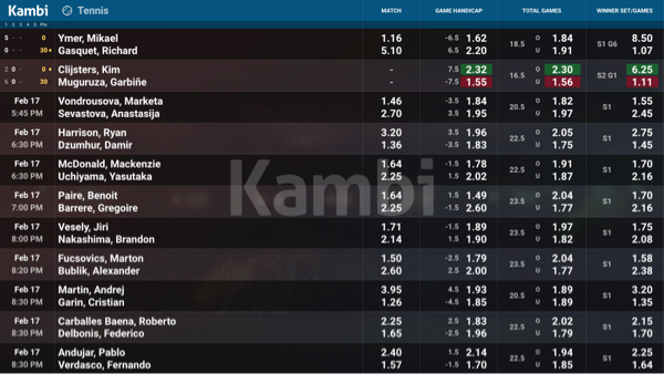
In our Digital Signage system we have a small header to allow as much screen estate as possible to display the odds tables. Long or high logos don't fit very well in this space, they will be scaled down to fit and small text might become illegible.
You can test the logo by scaling it down to 32px height and watch it on a screen in 100% size and decide if it's still legible. A three row logo is for example not optimal. Consider providing a simpler version of your logo for this space. What information does your logo need to communicate in this space?
We usually have a dark theme on the digital signage for best legibility in casinos. If you have a color version of your logo we will use it if it works, if not we will use the white version of your logo.
There is also an option to use a watermark on the digital signage. The watermark uses the white logo with high transparency as a background image. The transparency is handled by us, we just need the white version of your logotype.