When branding the Kambi client, the effective use of colors is fundamental to aligning with the customer's brand identity. We utilize a custom-made Figma plugin to streamline this process. To initiate the branding, we incorporate five essential colors, predominantly sourced from the customer's brand guidelines. Ensuring that the design theme includes these color values is crucial for a cohesive and accurate representation of the brand.
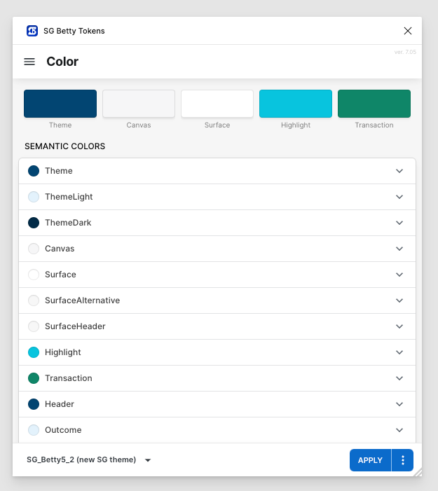
Here's a breakdown of the roles these colors play
Theme
Description: This color represents the customer's primary color and serves as the foundation of the design theme. Usage: The Theme color is often used prominently throughout the UI to maintain brand consistency and reinforce brand identity.
Canvas
Description: The Canvas color is the background color of the Kambi client. Usage: If your platform includes other products, it's advisable to use the same background color to maintain a seamless visual experience across the platform. The Canvas color acts as the base upon which other elements are placed.
Surface
Description: The Surface color is used for the background of elements that appear on top of the Canvas, such as cards or list items. Usage: This color differentiates interactive or grouped elements from the main background, ensuring clarity and visual hierarchy.
Highlight
Description: The Highlight color is used to draw attention to specific elements that need to stand out. Usage: In the standard setup, the Highlight color is mapped to interactive elements like the selected outcome button and headlines in promo cards. This color is typically one of the customer's secondary, tertiary, or accent colors.
Transaction
Description: The Transaction color is dedicated to actions related to placing bets. Usage: This color is used for critical action buttons, such as the "Place bet" and "Cash out" buttons, and elements like the "Cash Out" sticker. Similar to the Highlight color, the Transaction color is often one of the customer's secondary, tertiary, or accent colors.
By carefully selecting and applying these five colors, we ensure that the Kambi client's UI kit not only aligns with the customer's brand guidelines but also creates a visually engaging and intuitive user experience.
From the colors above we create our Semantic token sets. Visit this page to learn more about full token sets.
Additional color preferences
To ensure that our UI kit aligns perfectly with your brand identity, we offer the flexibility to customize various color elements according to your specific preferences. If you have particular colors in mind for any of the categories listed below, please let us know. Otherwise, we will proceed with our default color settings.
Text Colors
-
If you have brand-specific text colors, please share them with us. These colors will be used for all textual elements within the UI kit to ensure consistency with your brand's visual language.
Status Indicators
-
Error: We currently use red as the default color for error messages and indicators. If you have a different shade or color in mind, let us know.
-
Danger: Yellow is our default color for danger alerts. Should you prefer another hue, please specify.
-
Success: Green is used to signify success. Feel free to provide your preferred green or an alternative color.
-
Live: We use red to indicate live statuses or active processes. If you have a different color preference, please share.
-
Bet Won: Green is used to denote winning states. Let us know if you have a specific green or another color preference. We base this on the Success green. Have a look a the MyBets pages for context.
-
Bet Lost: Red is the default color we use to indicate lost states. If you would like to use a different color, please tell us. We base this on the Error red. Have a look a the MyBets pages for context.
-
Bet Open: Yellow is our chosen color for open statuses. If your brand uses a different color for this state, please provide us with those details. We base this on the Danger yellow. Have a look a the MyBets pages for context.
-
Bet Void: Grey is the default color representing void or inactive states. If there is a specific shade of grey that aligns with your brand, please inform us.
By customizing these colors, we can create a UI kit that not only enhances usability but also strengthens your brand identity across all digital platforms. We look forward to your preferences and are excited to tailor the UI kit to meet your specific needs.
Please provide us with your color preferences at your earliest convenience, or we will proceed with the default colors mentioned above. To read more about our color token sets,